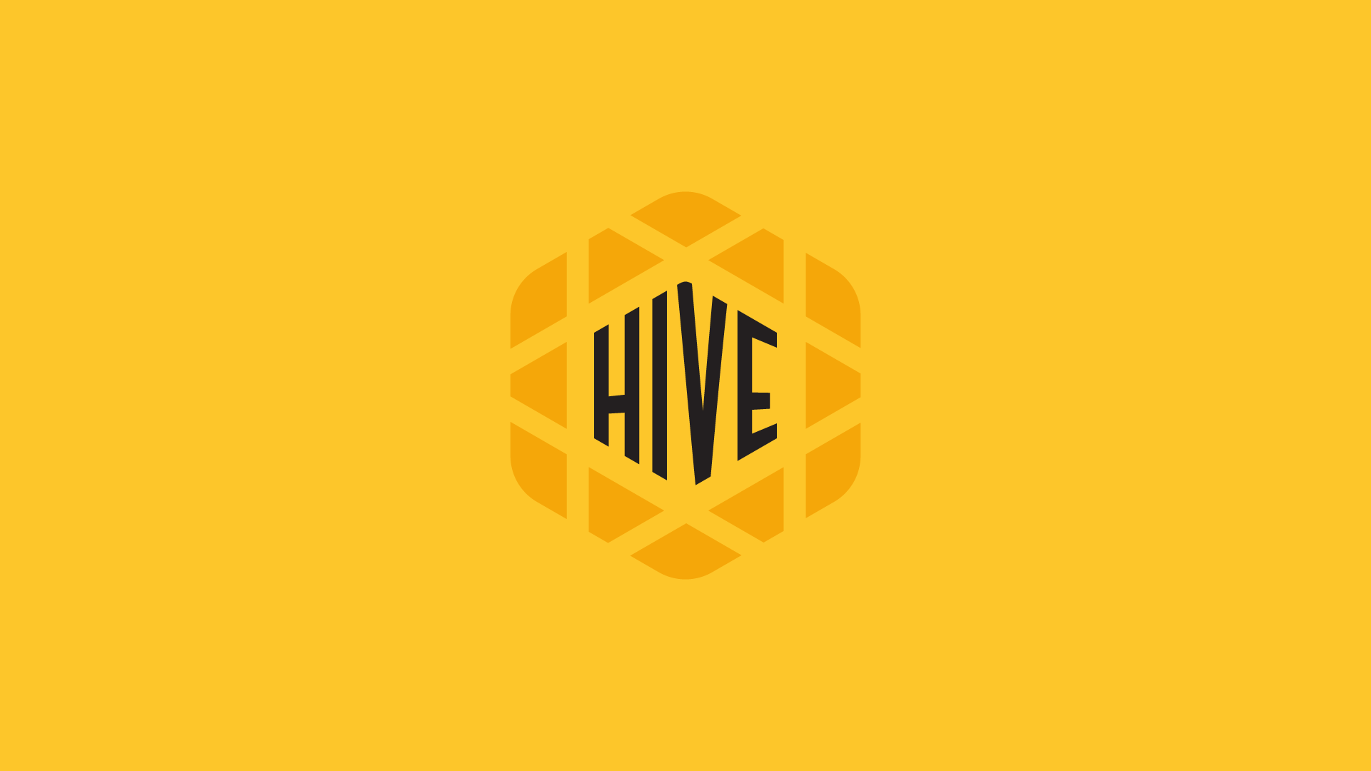
HIVE Branding 2025
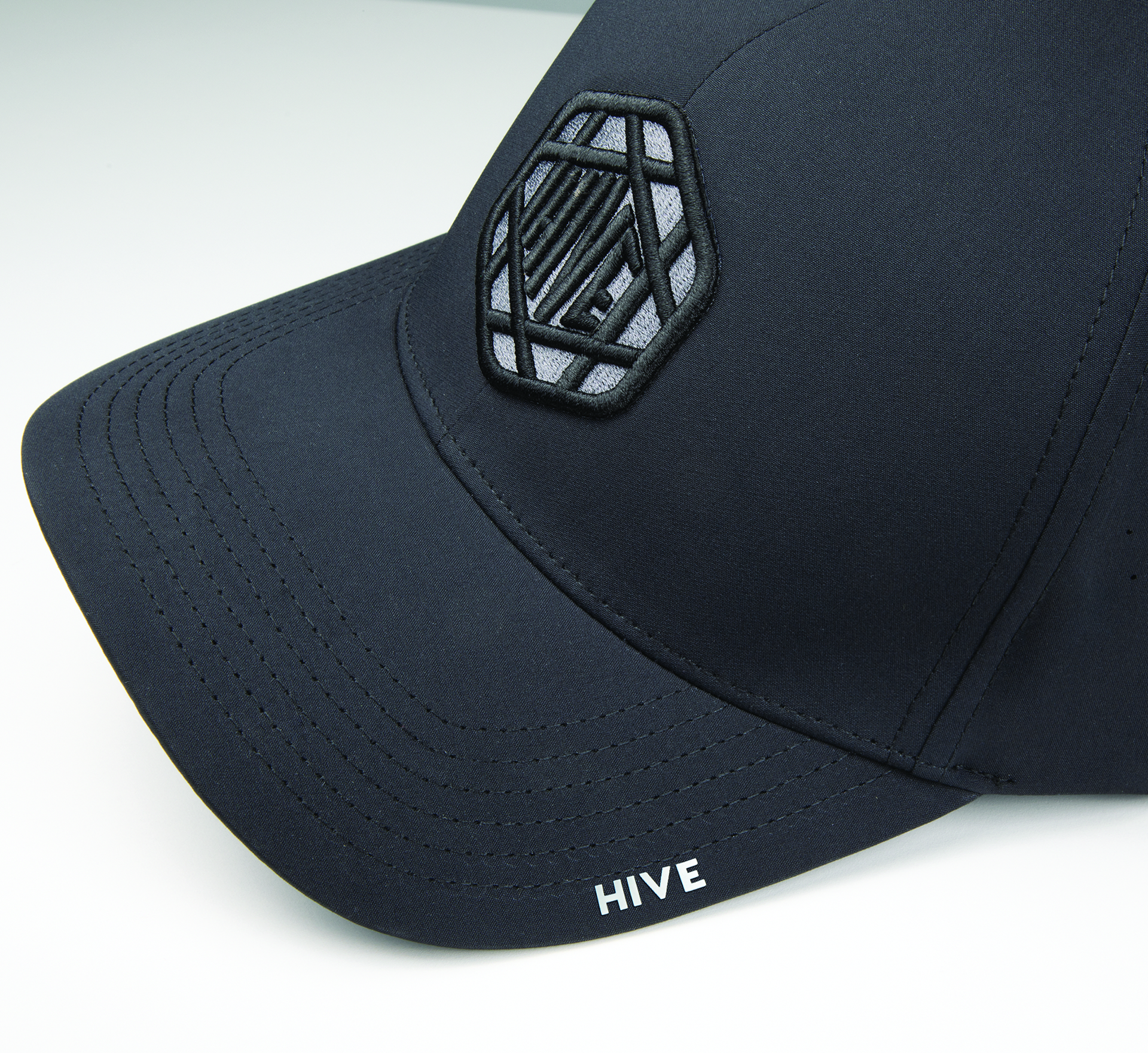
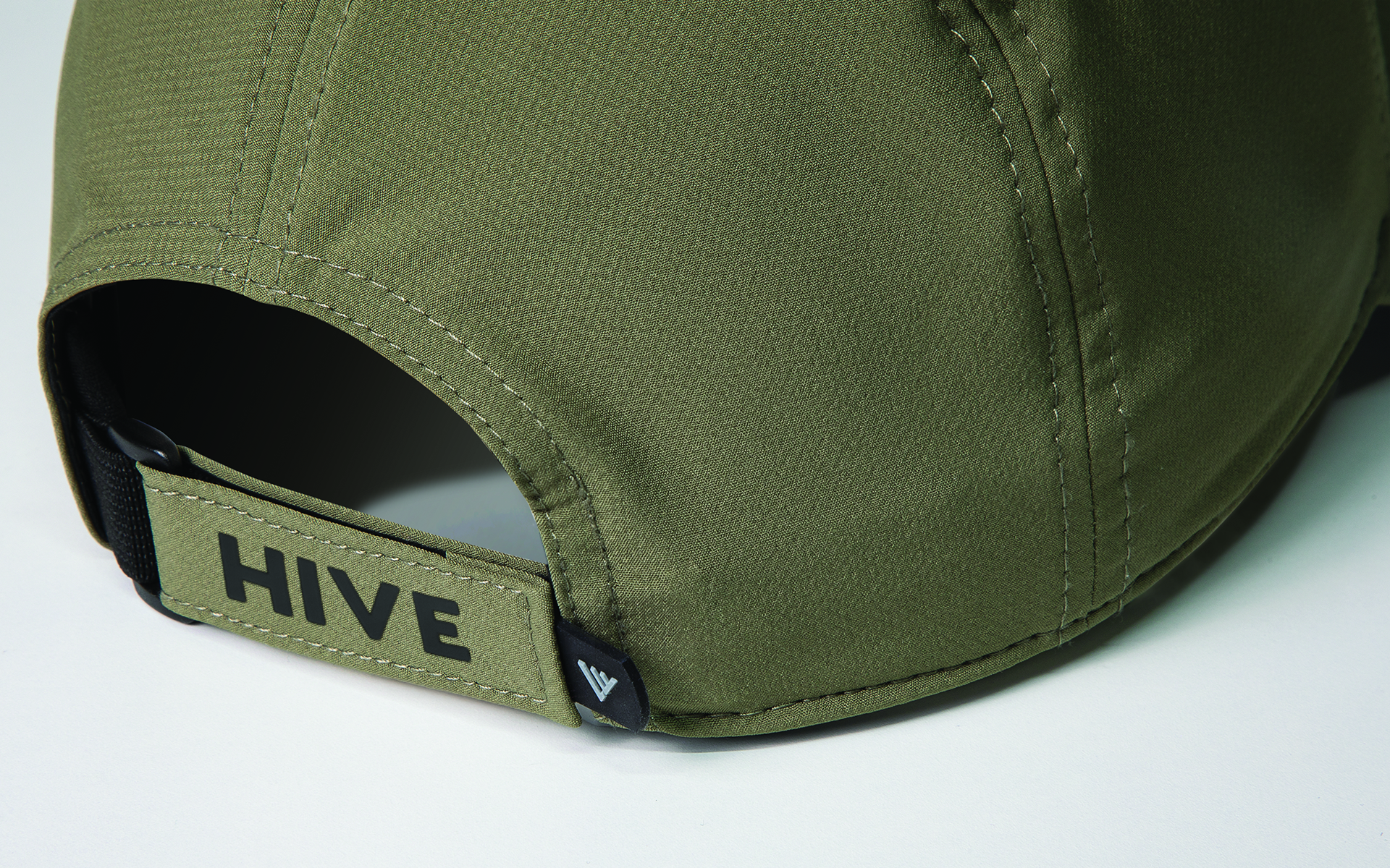
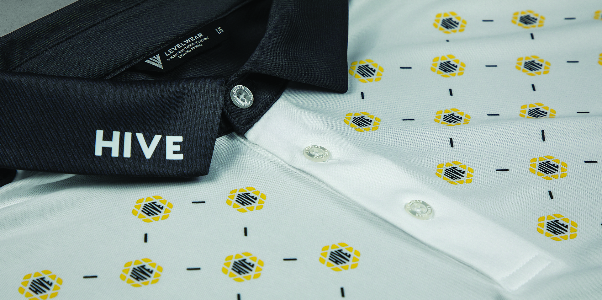
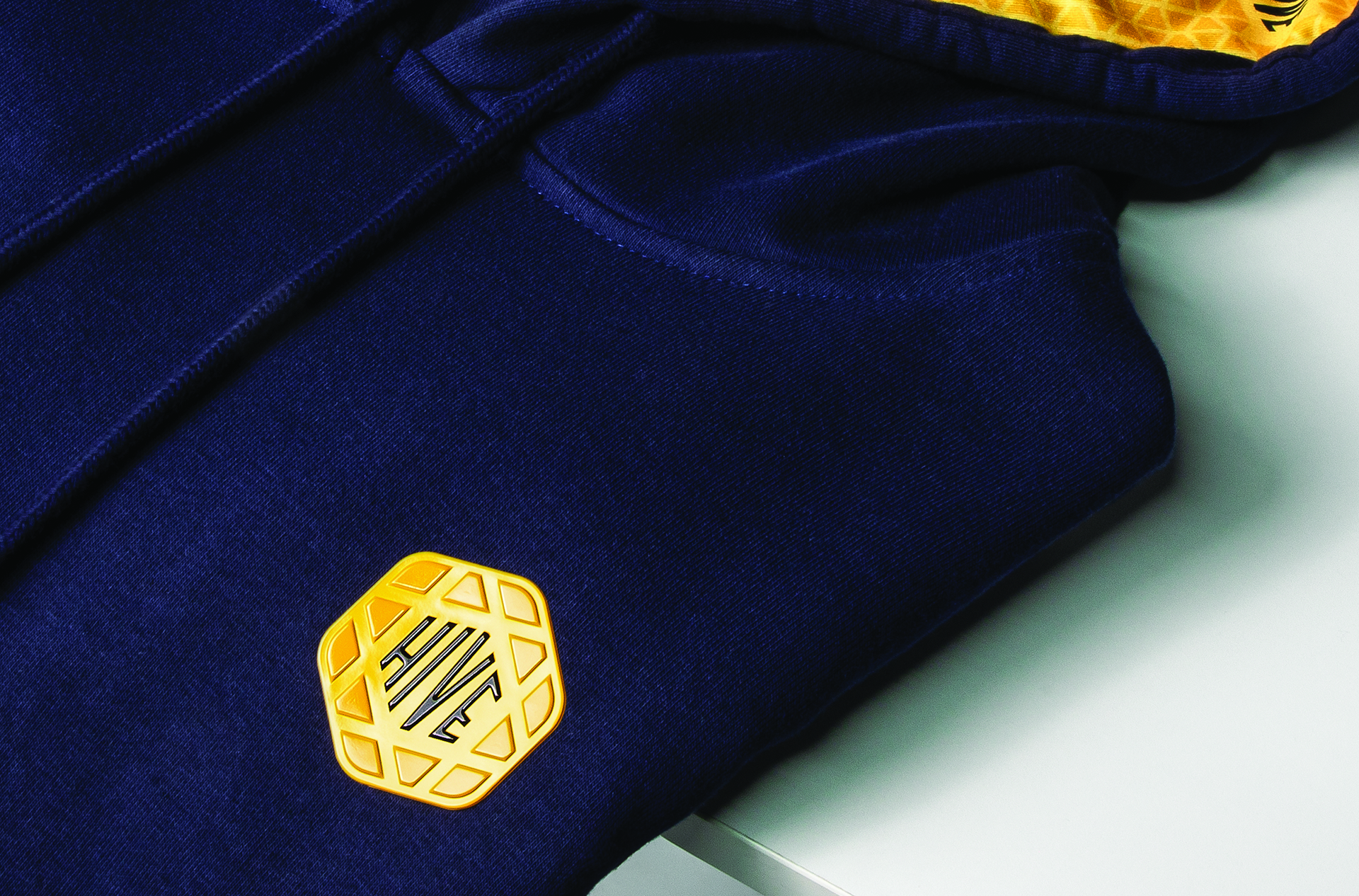
As my company expanded into corporate apparel, we needed a way to showcase printing techniques and treatments in a cohesive, branded format. I created a fictional startup, HIVE, with its own logo, color palette, and apparel graphics. This allowed us to present screen printing, embroidery, and specialty finishes in a polished, realistic example for potential clients.
Branding Concept / Inspiration
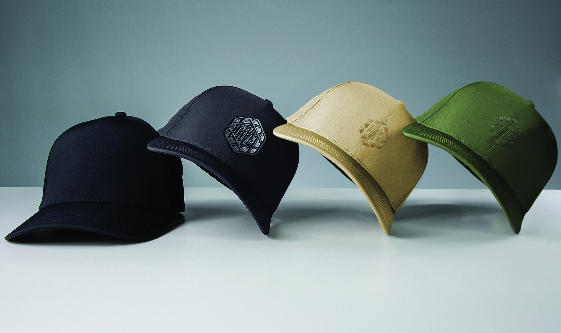
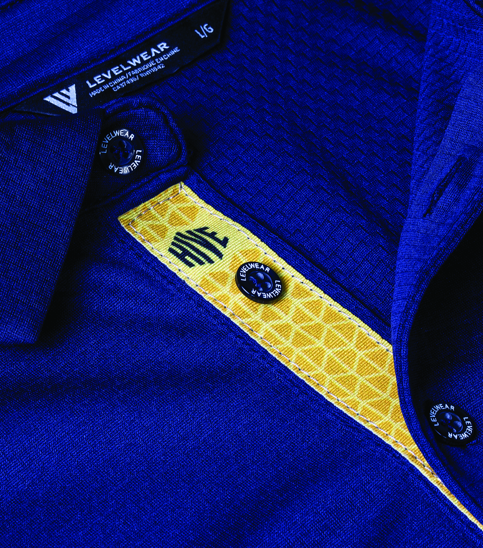
I aimed to give HIVE a modern tech aesthetic with a cohesive company brand feel. Incorporating yellow as a primary accent added energy and helped the visuals stand out in an otherwise neutral corporate space.
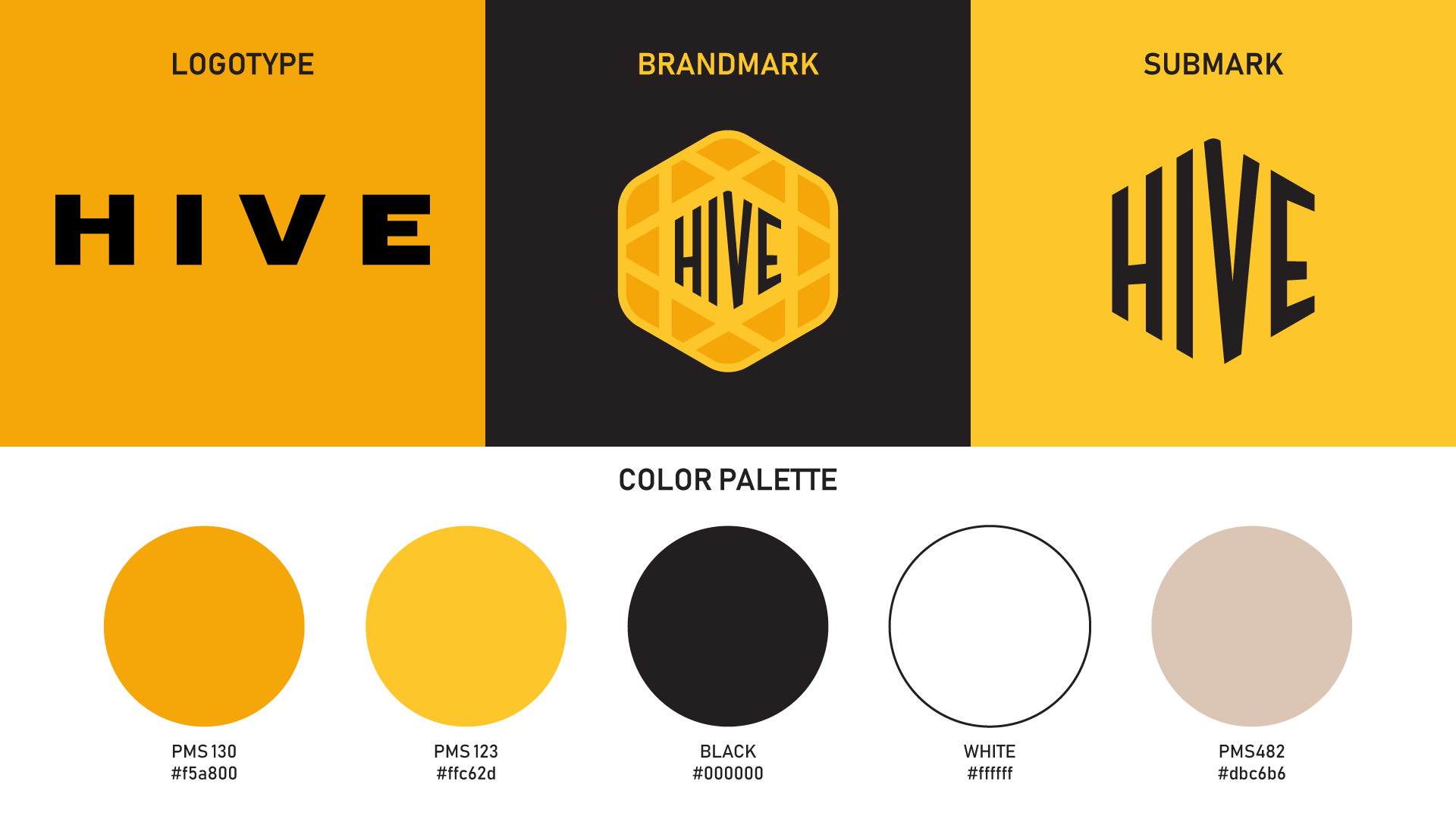
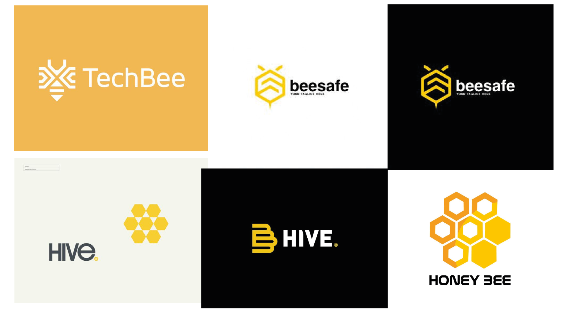
I wanted the HIVE branding to feel hive-inspired without being overly literal, as many existing hive logos already use multiple polygon shapes. Instead, I designed a single polygon and integrated the brand name within it, creating a mark that is instantly recognisable even when used alone. The solid, undivided polygon also symbolizes a unified team working together within one structure, reinforcing the brand’s collaborative and cohesive identity.
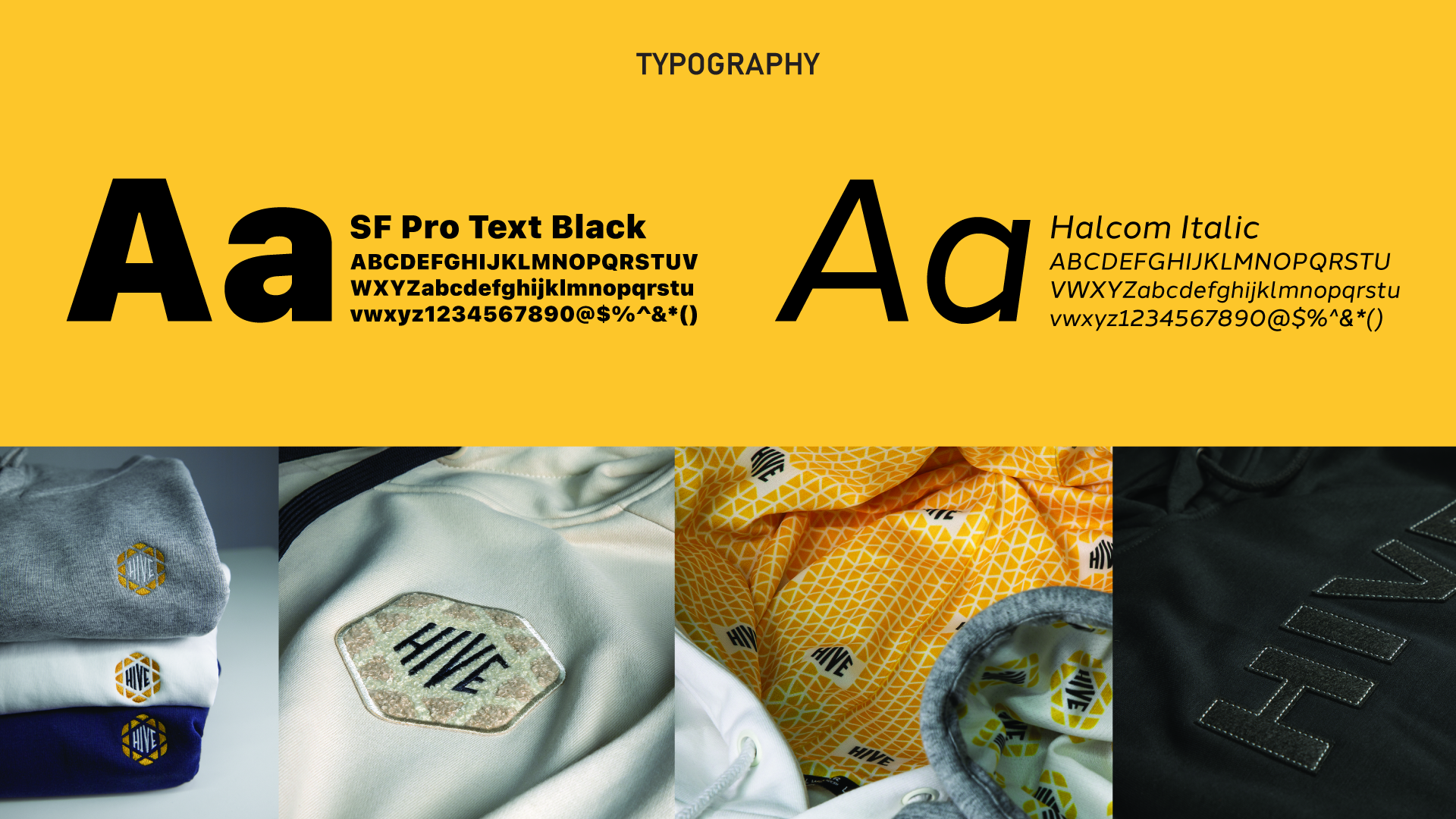
I selected two minimal sans serif fonts for optimal readability on digital platforms, aligning with the brand’s tech-focused identity. The visual system pairs a vibrant yellow with white, black, and sand, creating a clean, minimal palette accented by a bold pop of color—striking a balance between modern professionalism and eye-catching energy.